elCorner: Migrate and monetize a facebook group
elCorner is a community where members can interact with each other to buy and/or sell items. It started as a Facebook group and has grown to more than 125,000 members, where members post an article with one photo, a brief description of the object and its location. The intention of the posts could be to buy an item, to sell an item or just to share information.
Within the Facebook group, members write a comment saying “turn” in the publication of the article in which they are interested in and the owner of said object contacts the person based on the order of “turns” that users had taken. Eventually the seller came to agree on the price and delivery with one of the potential buyers, through Facebook messages, and the transaction was completed in person.
The community was characterized by its members. Users could interact in a secure and reliable platform. When a deal was made, was done.
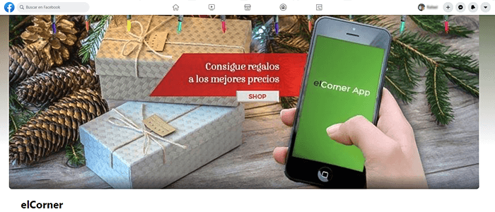
elCorner Facebook group
The greatest problem was the huge amount of time the group was taking from the few administrators, which had to approve each and every post to ensure the quality of the service provided. Plus, the fact of not receiving any economic benefit as the transactions were made offline.
As a group, Facebook didn’t allow any ads, reason why she couldn’t profit this way either. One of their greatest concerns was the fact that she didn’t want to charge users for posting. So, what could they do? How could make profit without affecting the dynamics of elCorner or the user? Why should they continue to exist?

The group had more than 125,000 members and just 3 administrators
Outreach to GBH: How did elCorner reach GBH?
elCorner reaches to GBH with the sole purpose of monetizing or making the group profitable impacting as little as possible the dynamics and experience that characterizes them.
The administrators decided the best way to achieve this was by transforming the group into a mobile application, where ads could be included. GBH analyzed elCorner’s dynamics and members and identified that this solution, in addition to seamlessly integrate ads into the user experience, could respond to the group members’ real needs by providing a better experience and improving the user flow through the buying and selling process.
Seeing beyond the obvious
In GBH we care to see beyond. Get to the core of the business to detect nearly or existing problems and deliver effective solutions that meet customer’s and user’s goals. For this reason, after carefully studying users’ behavior, GBH detected a number of improvements that could be implemented through the construction of the application.
- Position of the message in the group: Users whose posts were accepted, had to comment several times on their own posts to be placed at the top positions on group’s wall and thus increase their visibility.
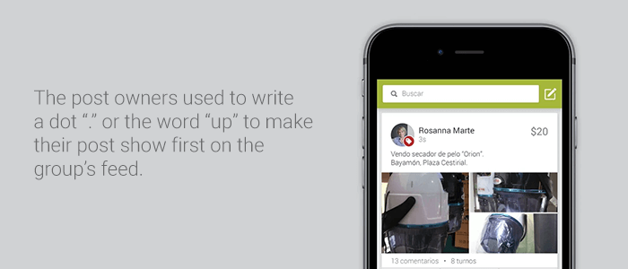
The post owners used to write a dot “.” or the word “up” to make their post show first on the group’s feed.
- Inability to search for items from specific sellers: Users did not have the ability to view all articles published by the same seller.
- Inability to control published messages: Once a publication was approved, it couldn’t be edited.
- Inconspicuous rules: The post’s rules were shown in the group’s description, but it was not mandatory to read or accept them by users, before or at any time, to be able to post on the group. This helped to create frustration when a member’s post was rejected, at the same time that increases the amount of work administrators had to deal with.

The rules were not easily seen and it created frustration when a user’s posts were rejected.
- No post standardization: Member’s had to read each post thorough to be able to realize what type of post it was (selling, buying, looking or sharing).
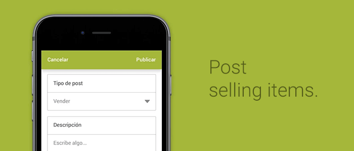
Post selling items.
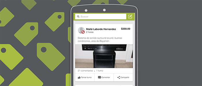
Post buying items.
- Just one photo: It was not possible to include more than one photo in a post. If a user wanted to post more than one photo, it would have to do a collage (in another application) and then add it to the post before submitting it, or add the pictures as comments once the post was accepted. This increases the difficulty for the administrators to verify that the articles are legit (upon post approval) and for users (when deciding whether to purchase the item or not) as there was just one photo to complement the description.
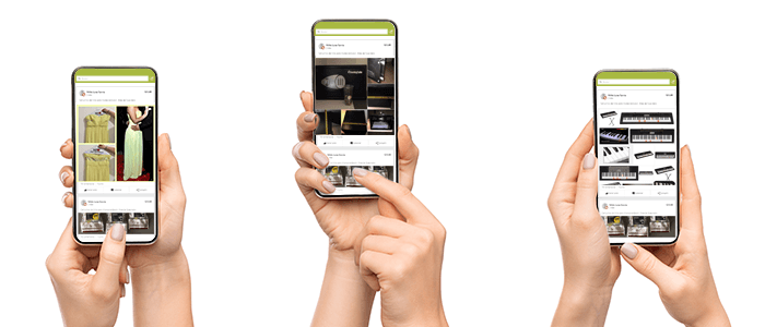
Users were forced to create collages of the products they wanted to sell in order to post more than one picture.
- Not being able to evaluate users: Members had no idea as to whom they were interacting with; nothing to let them know how good their items are, their manners, customer service, etc. They had to rely only on Facebook’s public profile.
- Integrate ads without affecting the user experience: Members are already used to the dynamics of posting, commenting, taking turns, and sending messages. This, as well as the whole members community, is what motivates them to buy and sell items through the group. This tendency led the group to become a sort of shopping club that the administrators wished to keep.
- Achieve the migration of over 125,000 users from the Facebook group to the mobile application with minimum resistance to change and drop-out rates.
- Preserve the user experience obtained by using the Facebook group as much as possible.
Their expectations
The client expected the delivery of a hybrid mobile application (for Android and iOS) that resembled as much as possible what they had on Facebook including interfaces, behaviors and the natural “scroll” which meant to avoid the normal hybrid slowness.
The application must be easy to use so users won’t feel a very drastic change once they migrate from the Facebook group to the mobile application. Another requirement was to implement a not-so-automated user flow that keeps the human touch through the app and where posts needed approval from an administrator in order to be published.
Results provided
As part of the project, we embarked ourselves in creating two assets: a mobile application and a landing page to promote the product as well as motivate downloads.
A landing page was created to present the application and invite users to download it. It will also serve as a platform to present each article within a shareable page users could use to promote their items even though all the communication needed to be through the mobile application.
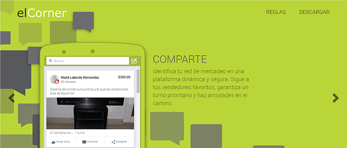
Mobile application landing page.
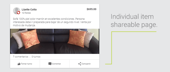
Individual item shareable page.
The design conceived for the mobile application isn’t only attractive, it also allows the user to easily navigate through the application and complete their goals more easily. The application helps the user find and complete all the activities originally possible on the Facebook group but, focusing on the main characteristic of the community which is buying and selling.
The types of messages were also standardized. The new design allows members to easily identify the most relevant information distinguishing between the different post types and focusing on the ones they are interested.
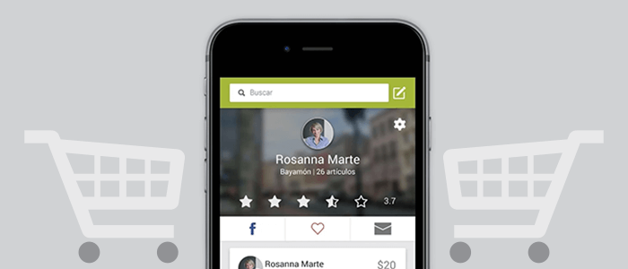
Member rating
A turn tracking system was designed and implemented, based on the dynamics of the Facebook group, which gives users greater control over their articles. A user rating system was also implemented which improves the collaboration and confidence by giving the members the opportunity to warn others about potential threats.
In order to increase and stimulate new interactions, members were given the opportunity of marking other members as favorites and receive a notification whenever that member posts. The number of photos allowed per item increased to three (3) in order to achieve a better perception of the item and allowing administrators to validate the publication faster.
Also, new administrator tools were created within the mobile application, such as the handling of claims with the presence of an administrator as an intermediary, warn users that are not following the rules, among others.

Member’s chat
Proposals and changes to meet business goals
One of the ideas proposed to the client gave direct access to the main content of the mobile application without reading the rules. The client felt it was necessary for all users to read and accept the rules before accessing to any content because not all users will come from the Facebook group. It will reduce the frustration of new members who are not used to elCorner’s dynamics.
Another idea was to automatically block post which were reported 3 or more times but the client thought it will reduce the human feeling of the application and a complaint system was designed and developed instead.
Services offered by GBH
GBH served as supplier for the design and implementation of the project. The direct communication maintained with the client helped share information on the project’s progress, present the deliverables on each stage and negotiate unexpected changes.
Other services GBH provided:
- User Interface (UI) and User Experience (UX) advice with the goal of designing the best experience possible for the end user and make a new user feel like an expert from the moment they sign in.
- Software architecture design based on the documentation submitted by the UX team.
- API implementation with Node.js and mobile application development with Ionic Framework.
- Project management from the initial kickoff meeting to the final delivery.
- Production environment configuration using AWS OpsWorks, allowing a dynamically scalable infrastructure.
Tools used (Technology)
A hybrid mobile application was developed using Cordova and Ionic Framework. The application was coded in Javascript and SASS was used as a CSS preprocessor.
On the other hand, a RESTful API (server application) was designed and developed to handle users requests and to store all the information posted. This application was coded in Node.js (ss6) and Postgres was used as the database.
A winning deal
The clients wanted to accomplish their business goals and we wanted not just to help them meet their goals, but exceed their expectations with cutting-edge technological solutions. Given the background that gave birth to the application, the clients didn’t want to implement a very automated system, they preferred to maintain certain manual processes like approving and banning users. We reached an agreement.
When the real business goals are understood, implementing a solution that does not affect, or affects as less as possible the end user, both parties attain delightful results. We focused on identifying ways to provide a better user experience to the members without harming the business goals or the community values.
Our goal will always be to benefit the end user through customer satisfaction. The client is very happy with the final product and with the process used to achieve its conceptualization and construction, and we were able to improve the usability to the end users compared to the Facebook group.
